Should Your Resume Have Columns? (+ Examples)

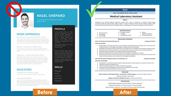
There are tons of different resume formats out there. A quick Google search of "resume examples" will turn up millions of different resume formats and designs. One common resume design consists of two columns rather than the traditional one-column resume.
Should you be using a two-column resume template?
Is there ever a situation where the two column resume formats are better?
Is there any benefit to using a two column resume template?
Our experts say not really. Using a creative resume template could actually be costing you jobs!
In this article, we'll show you why you should avoid using two-column resume templates and examples of how to format your resume for the best chances of success.

4 Reasons Not To Use a Two-Column Resume
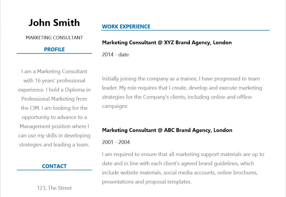
Here is an example of a Two-Column resume format:

1. They don't work well with ATS systems
Most companies today use ATS (Applicant Tracking System) software to automatically scan your resume. These systems scan the content on your resume to see if you're a good fit for the position. Many times a candidate is qualified but their resume isn't optimized for the ATS scans. ATS systems reject nearly 75% of resumes submitted.
You run the risk of getting rejected by those systems when you use two column resume templates. Use of non-traditional formats confuses many of those programs.
Applicant tracking systems don’t appreciate colorful text, creative border designs, columns, or any of those other tricks you might consider for your resume template. Instead, the typical ATS wants to see clear, basic resumes filled with text and white space. The fact is, you have to give these machines what they want. Otherwise, you will never get your resume past the machine and into human hands.
The following should never be included on a resume:
Charts
Columns
Graphs
Tables
Graphics and infographics
Images
Icons
Illustrations
Logos
Fancy fonts
Including any of the items above can make it difficult for an ATS to screen your resume.
Creative resumes will do you more harm than good.

2. Hiring managers prefer a standard format
Hiring managers and recruiters can go through hundreds of resumes a week. They spend an average of 6 seconds viewing your resume before deciding to look into it further or reject it.
Hiring managers are used to a traditional, single column resume template that allows them to quickly locate the information they're looking for. Although a two-column resume may not be difficult to process...we're talking about a matter of seconds. You have a few seconds to make an impact and using a two-column resume makes your resume just a little more difficult to understand.
3. Formatting gets distorted online
Although the two-column resume may look good on your computer, it could look very different to someone else opening the file. Many job seekers use a PDF to prevent these distortions, but this isn't recommended. You should always send your resume in Word unless the employer or hiring manager specifically asks for a PDF.
When you use a two-column resume in Word, you run the risk of the file getting distorted if someone opens your resume in another version of Word or any other processor. Also, computer scans may use OTC (optical character recognition) that will scan your resume linearly--two-column resumes might translate badly in these cases.
4. It won't help you stand out
A common reason to use a two-column resume is because the applicant wants to stand out, or look more modern. As we explained above, these formats can actually make it hardly to digitally or visually scan, so it's not a good way to stand out.
Using a two-column resume format also runs the risk of running out of space for all your content. If you spend too much of your two-page resume on lines, columns, and white space, you won't be able to fit in all the keywords and information you need to land the interview.
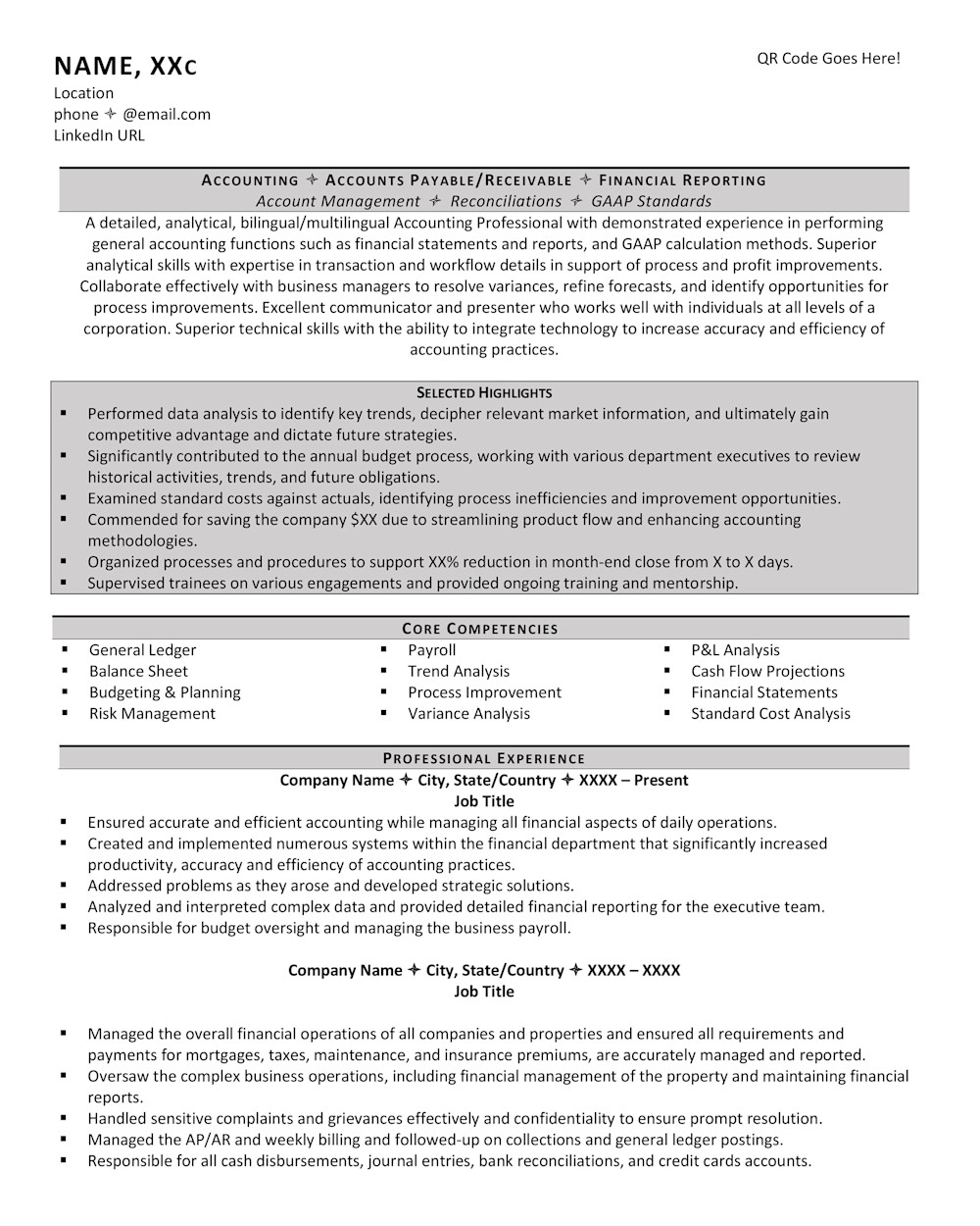
A Good One-Column Resume Template:

Expert Tip
View 200+ more professional resume samples for all industries, along with a guide to writing resumes from our career experts.
This is a standard one column resume format and design that hiring managers are used to, with clear section headings and only one column. It is easy to scan for both a computer and a human.
Summary
While you might think a traditional format makes your resume look like every other resume, that's actually part of its strength. People who review hundreds of resumes expect a format like this to quickly identify key information, like your past job titles and your contact information. Stick to it, and good luck with your job search!
Related posts:
