The Best Fonts and Size to Use on a Resume (Updated 2024)

Finding a job is tough these days, with steep competition and hundreds of applications per open job listing. That’s why your application has to stand out from the crowd.
You want every aspect of your resume and cover letter to convey that you’re the best fit for the job. After you’ve considered your experience, skills, education, and qualifications, you have another choice to make: what is the best font to use for your resume?
Your resume font is one of those things that can either support your message (I’m perfect for this position!) or send the wrong message (I’m too old/too young/too out of touch for this job). In this guide, we share the inside secrets. We’ll give you the 8 best fonts to use on your resume and how you can choose the right fit for your resume.
The best fonts for resumes (video)
Font selection is an important part of your resume creation because it sets a tone for your whole document. You can use different fonts for the body and the headings, but you don’t want to use more than two.
The fonts listed above – and detailed below – are all good, clean font choices. Of course, any font with too many flourishes risks being illegible to the ATS (applicant tracking system). So you want to avoid them at all costs. In short, you want your ideal resume font to come across as professional, not detract from your message. Luckily, we have you covered. Let’s take a look at the best fonts for a resume below.
Expert Tip
ZipJob's blog includes hundreds of articles on career resources, resume writing, and the job search written by career experts.
1. Calibri
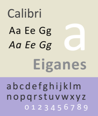
Calibri takes number one on our font list and has really gained popularity lately. It’s one of the best fonts for resumes as it’s clean and clear. This one is professional and more modern-looking than some other fonts, making it a great font to use on both a resume and cover letter.
Lucas de Groot, the creator of the Calibri font, described it as having “a warm and soft character.” Microsoft also has Times New Roman with Calibri as the standard font for Word and other applications.
Example:
Calibri is clear and easy-to-read. That means that it’s ideal for your next resume. The hiring manager will have no problem quickly scanning the content of your application.
2. Arial
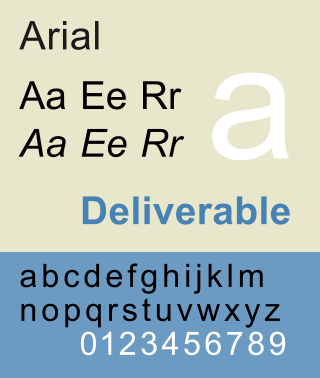
Arial is another great font to use on your next resume. It’s part of the popular sans-serif font family. Many people have said that Arial is one of the easiest to read. As if that wasn’t enough, it also has a more modern look to it than other fonts.
Looking for some more information? Here is a good description of Arial from Wikipedia:
“Arial contains more humanist characteristics than many of its predecessors and as such is more in tune with the mood of the last decades of the twentieth century.”
Example:
Arial is one of the best fonts for resumes. The sans-serif typeface is simple yet effective. If you don’t want your font to detract from the content of your resume, use this font.
3. Helvetica
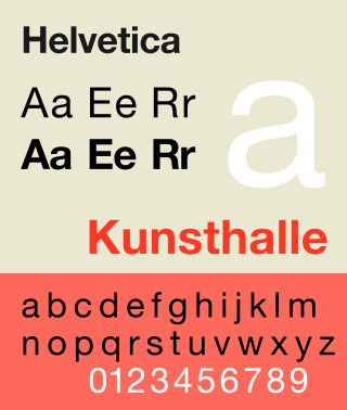
Next up, it’s one of the most popular fonts in the world. Helvetica is an excellent sans-serif font you can use for your resume. Helvetica is very similar to Arial and requires close inspection to really tell the difference. It, too, offers a clean and modern look that’s easy on the eye. It also comes in a variety of weights and styles.
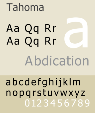
4. Tahoma
Also a sans-serif font, Tahoma has a more modern look than the rest of the fonts listed. It was used by Microsoft for many years for a variety of different programs. While it is not as popular as the likes of Arial and Helvetica, it’s still one of the best fonts for a resume.
Example:
Tahoma is a great option that gives your resume a kick while still appearing professional. Try this one when you want your application to stand out.
5. Trebuchet
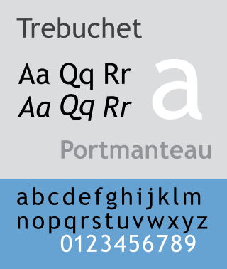
Trebuchet is another san-serif font, created by Vincent Connare. His goal with Trebuchet was simple: to create a font that appeared well on a screen and also provided a contrast in texture to Verdana, which is next on our list.
Example:
Trebuchet is a great option since it was designed to appear well on a screen which is how most employers will view your resume. It also provides a modern kick compared to other traditional fonts on our list.
6. Verdana
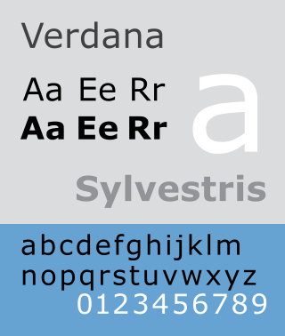
Verdana is another sans-serif which looks ace on a resume. It was designed in 1996 by Mathew Carter, who worked for Microsoft. Verdana was created to appear well on a small screen as well as screens with low resolution.
Example:
Verdana is a good font choice to use on applications. It is a simple typeface that is spaced perfectly, making it super easy for anybody to read.
7. Garamond
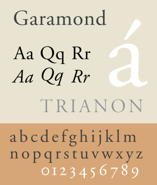
Garamond is a collection of old-style serif fonts created by 16th-century French engravers. Although it is a good choice, it may seem a bit stale and outdated to some. If you have a lot of experience, it may be a good choice.
Example: Garamond is a classic font that is suitable for some types of resumes. If you are applying for a highly traditional role, you may find that this font style gives your application a classic look.
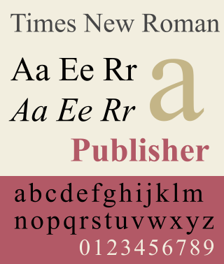
8. Times New Roman
This is probably the most debated font when it comes to resume writing. Times New Roman is a classic serif typeface that may be a bit too overdone for a resume. Although no hiring manager will dismiss your resume because you used Times New Roman, it may not stand out as well as the other fonts on our list.
Example:
Times New Roman may be a bit too “classic” when it comes to making your resume stand out. It is still an acceptable font to use, especially for those who want to go with a traditional look.
Times New Roman is a classic for print that you see in many types of media, including newspapers and books. However, resumes are now often viewed on computers or mobile devices. Sans serif fonts (such as the one we use on this website!) are easier to read on a computer screen. it may help you make your font decision if you know whether or not your resume will be read on paper or on a screen.
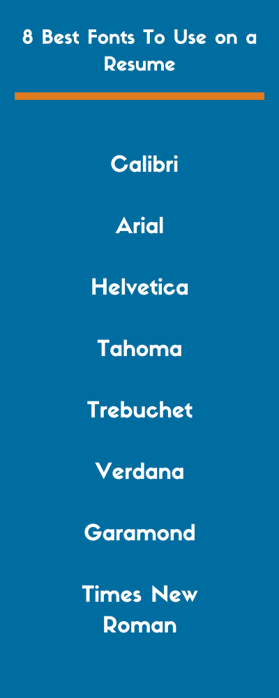
8 best fonts to use on a resume (graphic)
Bold and italic font: When to use it
Now that you know what the best fonts to use are, let’s talk about one crucial point. When should you use bold and italic fonts? You don’t want to go wild when it comes to adding extra character to your text. Here’s a breakdown of when you can use each of them:
Bold font
It’s not wise to bold any text within the main body of your resume. That includes your summary and any bullet points you include. However, you may want to use the bold feature when you are adding information, such as your contact details in the header.
Italic font
Resist the urge to italicize words that you want to emphasize. That can look chaotic. Instead, you can use italic font when you’re including certain details, such as your years of employment or the year you graduated. When and where you use this font will depend almost entirely on the overall style of resume that you choose to use here.
How to choose the font for your resume
Trying to decide which font to use? Let’s go over some factors to keep in mind when choosing a resume font for your next application.
1. Resume readability
Readability is, far and away, the most important thing to consider when choosing a font. It sounds obvious but you’d be surprised how many people completely mess up on this one.
If readability is your only concern, any basic serif or sans serif font will do the trick. It’s also extremely important to avoid those comic-looking childish fonts at all costs.
Some fonts were designed to look better on a screen, while others look better when printed out. Think about who is viewing your resume and how they are likely to view your resume. You should be able to use your own judgment to determine readability.
2. Resume font size
We’ve been so intrigued by font styles that we almost forgot to talk about the size. But it matters more than you might imagine. Too big or too small, and you could ruin your chances of success. Generally, you should use a font size between size 10 and 14.
However, it is very important to realize that some font styles run bigger and some run smaller. For that reason, it’s important to make a judgment on the font size after you’ve already decided on a style. That way, you can make sure that it’s legible.
Your goal is to maximize the ease of reading your resume without making the text look overly bloated. Of course, you’ll have to use your best judgment when deciding if it looks bloated. But, if you stick to fonts smaller than 14 points, you will be fine in nearly every scenario.
There’s one exception: your name. Your name is often the largest font size on your resume, with good reason – you want it to stand out and stick in your readers’ minds! This part can be about twice as big as the other section headings of your resume.
Another important thing to keep in mind is the font size effect on resume length. Obviously, the size of the font can dramatically change the length of your resume – you should always use this to your advantage.
For example, say your resume is just a line or two over a single page or just a few lines away from filling a full page. Adjusting the font just one-tenth of a point can make the text fill out the rest of a page or prevent it from spilling over into the next one. These slight adjustments can work wonders in making your resume more aesthetically pleasing.
3. Purpose of a resume
Font styles can change the entire feeling of a resume. Remember the message you want to convey with your resume. When you take a quick glance at it, does it convey the purpose you want it to? Does it suit the field to which you’re applying?
Does it look like the resume of an old, seasoned veteran? Or, does it look like it is representing a young professional? A recent college grad?
We don’t mean to suggest your resume font is going to manipulate people into thinking you are something you are not. Just like a piece of art can induce certain feelings, so can a good resume. A great font selection will pop out immediately. It should give hiring managers and recruiters an idea of who you are and what your purpose was for writing the resume they see before them.
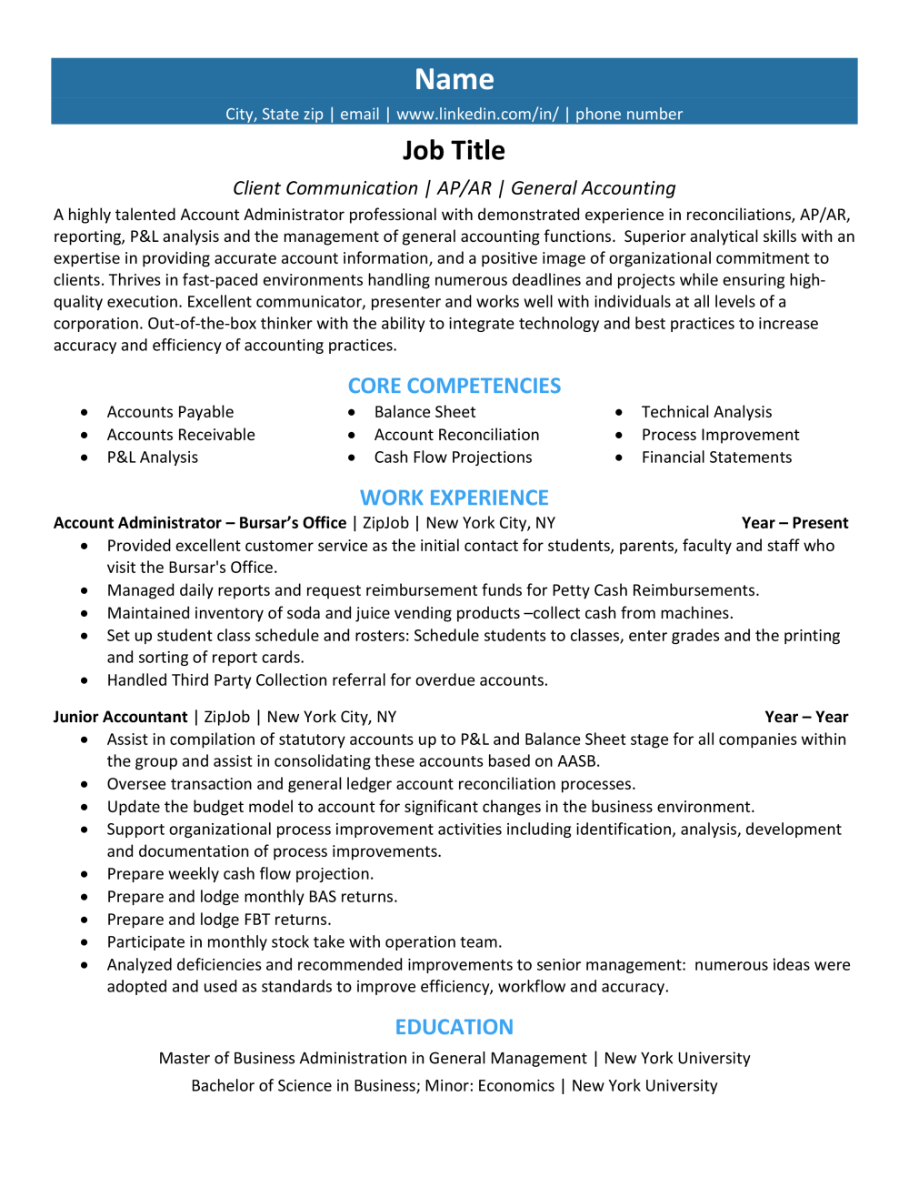
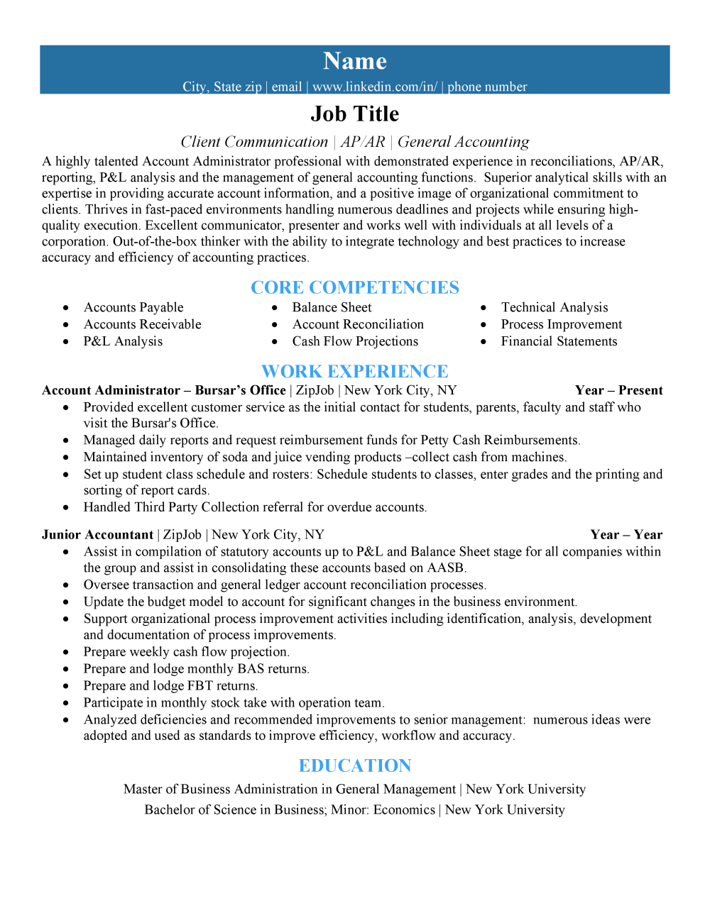
Compare these versions of the same resume:
Fonts you should never use on a resume
We hope it goes without saying but absolutely do not use Comic Sans or any similar “fun” font on your resume. It will make you stand out, but not in a good way. It’s so childish that it will convey to the employer that you’re out of touch with the professional world.
Just in case you’re not sure what font-type we’re talking about, here are a few examples:
Comic Sans
Impact
Wingdings (Wingdings)
Avoid using the above under any circumstances. Not for headings, not for symbols, and definitely not for your name. Keep it professional. Just for comparison’s sake, here is the resume we used above with a Comic Sans font.
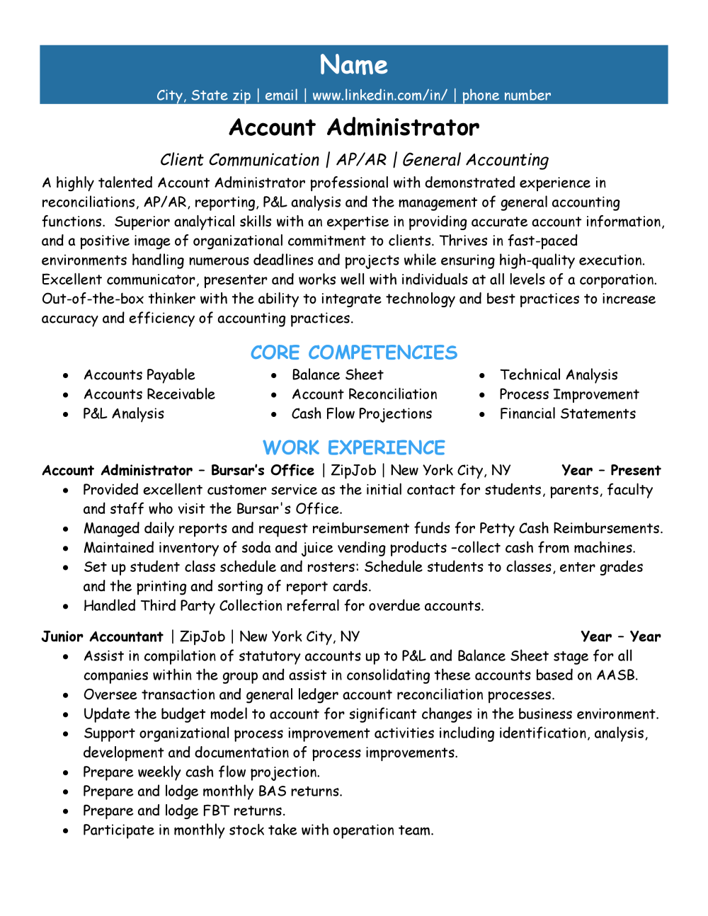
As you can see here, the font looks immature and the content doesn’t fit on a single page anymore. The work experience is completely overridden by the unprofessional font choice. This will most likely get your resume tossed out of hand. Say it one last time: You should never use Comic Sans for your resume, cover letter, or any professional communication.
Can you combine fonts on your resume?
The short answer is yes! Most resume templates include a couple of font styles. However, you need to ensure that these fonts work with one another. As a general rule, it is safe to choose one font (perhaps a serif font) for headers and one (maybe a sans-serif font) for the finer details. There are many exceptions to this rule, though. When you are creating the design of your resume, you have to consider how the entire document looks, after all.
Summary
The font you choose for your resume is important. You want to strike the perfect balance of uniqueness, class, and professionalism. Keeping these things in mind when choosing a font can be the difference between a call-back and radio silence.
Remember that the “perfect” resume font is subjective. While you should certainly select a font that doesn’t distract from your message, having a well-written resume is more important. While drafting your resume, keep these factors in mind. You’ll be on your way to the next interview in no time!
Ready to take the next step in your career? To make sure the content and format of your resume are ready for online applications in 2024, check out our free resume review tool. It’s always worth giving yourself the competitive edge.

